Home » Insights » Data » The differences between infographics and data visualisation
The differences between infographics and data visualisation
March 21, 2021
Whether used in marketing or in a business setting, how you visualise data is important. In this blog, we show the differences between infographics and data visualisations.
21 March 2021
The differences between infographics and data visualisation
The key points…
Infographics simplify data subjectively, guiding readers to a predetermined conclusion
Data visualisations represent data objectively in real-time, presenting just the raw data to allow users to determine their own conclusions
Infographics Vs Data Visualisations
In today’s world of big data, how businesses choose to display their figures can affect how quickly readers can interpret the information and what conclusions can be drawn from it. While on the surface, the terms data visualisation and infographics may appear to be the same – they’re often used interchangeably – there are in fact some subtle differences between the two. From the data displayed and the way they’re presented to the time they take to create, you’ll see that while the two are related, they’re not the same.
Infographics
Let’s first look at infographics. Often shared on social media channels, infographics are a visual representation of data in a creative and appealing way. Usually artful and accompanied by lots of supporting graphics, these infographics tell a story through a clearly defined narrative. Used to support an argument, they have an obvious conclusion and guide the reader towards that judgment.
Frequently designed to be accessible to as wide an audience as possible – often made up of readers who are not experts on a subject – the key to infographics is making them easy to understand. Often this is accomplished through a visual theme with a clear narrative.
Web content – Because they’re easily sharable, infographics have a lot of value in SEO. Each time they are reshared your brand awareness grows. This should result in useful backlinks and could lead to increased interest in your brand.
Marketing content – We’ve already discovered that infographics tell a story. This can help with your marketing efforts, introducing you to a top of the funnel audience and converting them to your way of thinking from the outset.
Marketing content – We’ve already discovered that infographics tell a story. This can help with your marketing efforts, introducing you to a top of the funnel audience and converting them to your way of thinking from the outset.
CVs/Resumes
Blog posts – They say a picture can tell a thousand words – a theory which has value in today’s internet generation and their short attention spans. Rather than read a lot of words in a blog post, an accompanying infographic can communicate the same information in a fraction of the time.
Case studies – Like in blog posts, infographics can break up the content in a case study, summarising results or adding visual interest to otherwise large sections of text.
“
However you choose to display your data, for maximum engagement, it’s important to ensure it’s on-brand, easy to understand and focussed.
Data visualisations
Data visualisation presents data in an objective way. By delivering data in a raw form, users can make their own conclusions.
Showing interactive data, these data visualisations frequently update in real-time, leading to different conclusions each time the information refreshes. Because of the complex information they provide, the aim of data visualisation design is to enable the user to understand the data at a glance.
In order to make these dashboards or screens as clean as possible, there’s no narrative and few visual embellishments (or chartjunk as it’s humorously known). Rather, the data is presented in its raw form, with the visual elements used to demonstrate numeric information in a more user-friendly graphical format.
When to use data visualisations
Dashboards – Whether displayed on a smartphone or a giant multimedia wall, data visualisation can display a lot of information in a clean and easy-to-understand way. Whether analytics for a social media campaign or energy production from an offshore wind farm, this data can be updated in real-time, allowing key decisions to be made in seconds.
Newsletters – Whether designed for an internal or external audience, data visualisation can portray key company results and metrics in an easy-to-digest way.
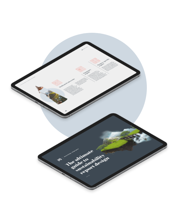
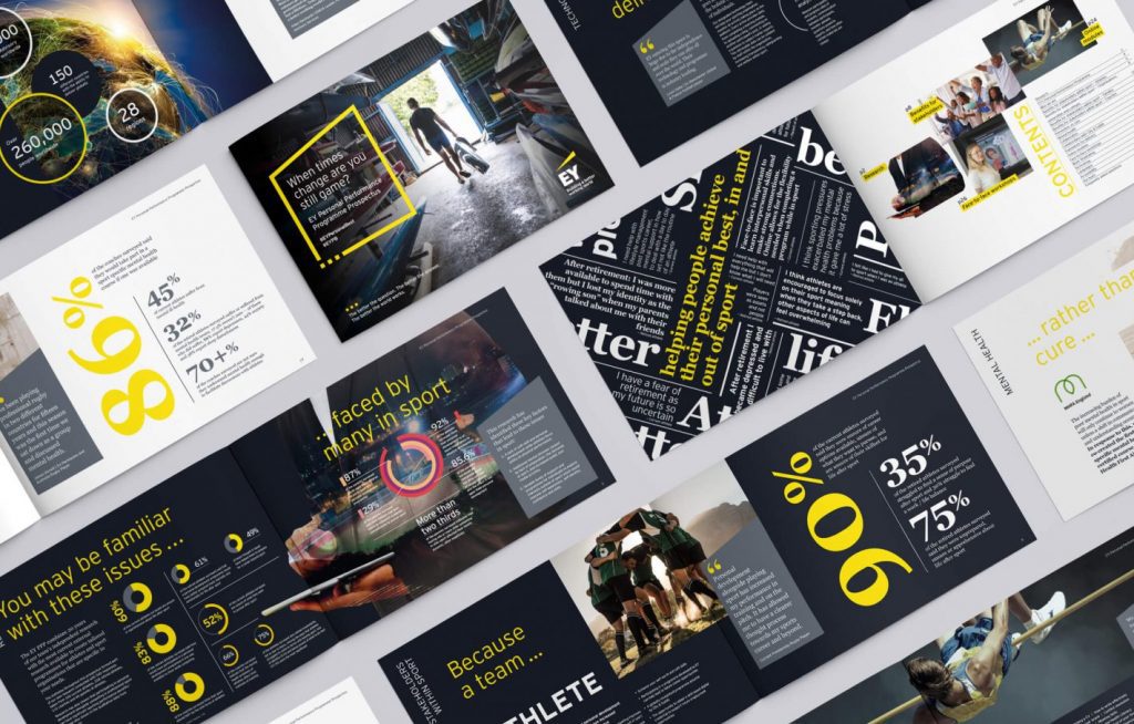
Reports – Made up of lots of numeric data, reports risk being dry. Data visualisations can add some ‘colour’ to reports, such as charts and graphs. This micro-content can also be used in social media and marketing campaigns to raise awareness of the key results of your report.
In summary…
Data visualisations and infographics are both efficient ways of displaying your data in reports, on the web or on interactive dashboards. However you choose to display your data, for maximum engagement, it’s important to ensure it’s on-brand, easy to understand and focused.
Contact JDJ Creative for infographic design or data visualisation
Our team of graphic designers love taking complex big data and presenting it in easy-to-interpret ways. If you require infographics or data visualisations for your marketing or business strategy, get in contact with our design team today at hello@jdjcreative.co.uk or fill in our contact form.