23 November 2020

Corporate review
design: Reimagined

Introducing the McKenzie-Delis Packer Review

We’re delighted to have partnered with DIAL Global to create the McKenzie-Delis Packer Review into diversity & inclusion in the workplace. An important document, released at a time when we have the chance to make the maximum positive impact on our workforces.

How JDJ Creative designed the Mckenzie-Delis Packer Review

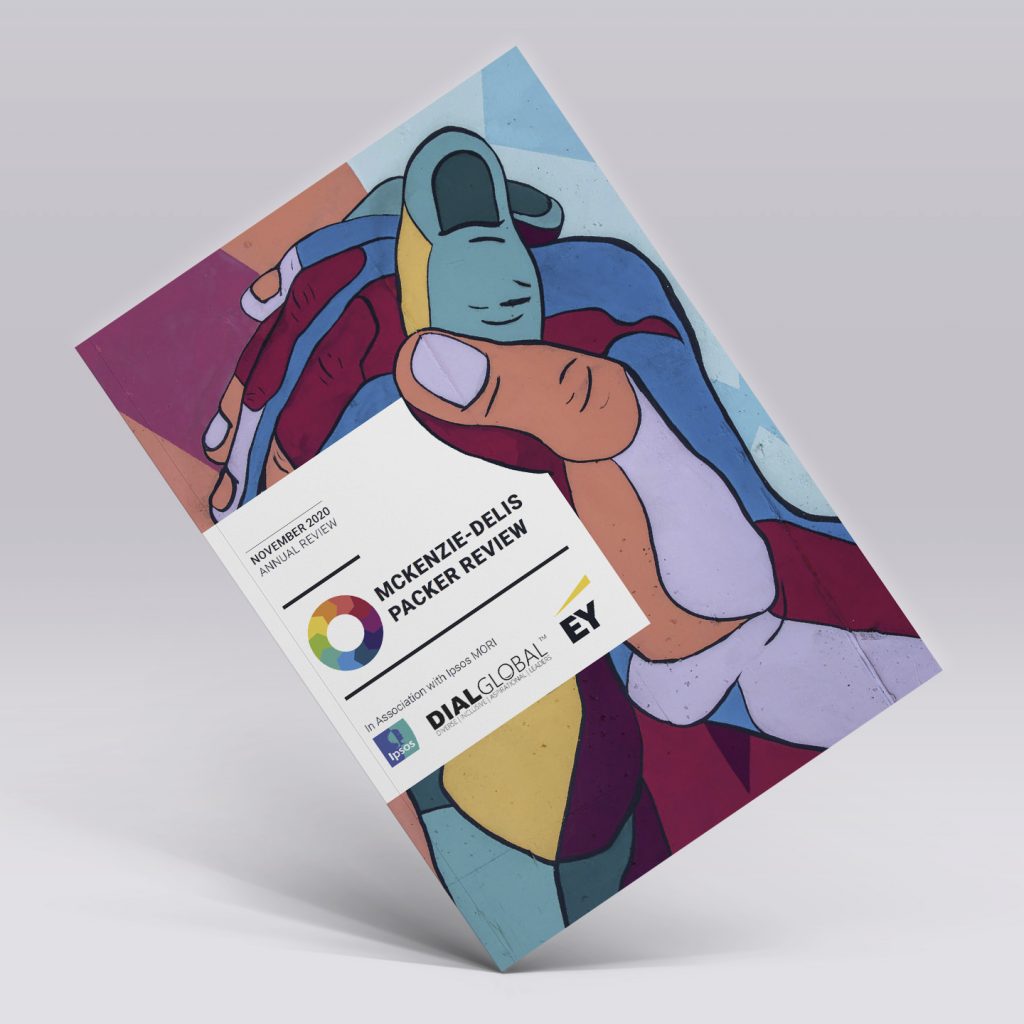
How do you design a report that encompasses the themes of revolution and change, whilst still maintaining all the corporate elements of an annual report? That was the challenge we at JDJ Creative faced when DIAL Global tasked us with designing the McKenzie-Delis Packer Review into diversity & inclusion (D&I) in the UK workplace – a challenge we were delighted to accept.

A groundbreaking report, this document represents the first comprehensive review of D&I in the UK. Taking a holistic look at the current situation in the UK, the document further provides actionable recommendations on how companies can move the dial on D&I.

This report represents a real vessel for change.

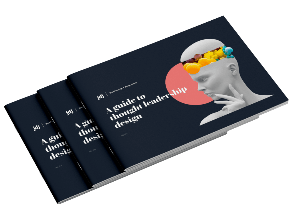
Given its subject and purpose, we couldn’t design this document in the same style as many similar reports which have come before. Using ‘corporate-friendly’ typefaces and the same stock images of diverse workforces sat around a boardroom table would be unimaginative and counterproductive.

Positively, the team at DIAL Global had the same idea, so it gave us free rein to design the look and feel of both the document and the brand itself…

Telling a brand story through images and typography

Alongside the global pandemic, 2020 has been a year of empowerment. People from all backgrounds and races have come together to campaign against social injustice. This was the prevailing mood we set out to reflect within this document. The zeitgeist we wished to capture through these pages.

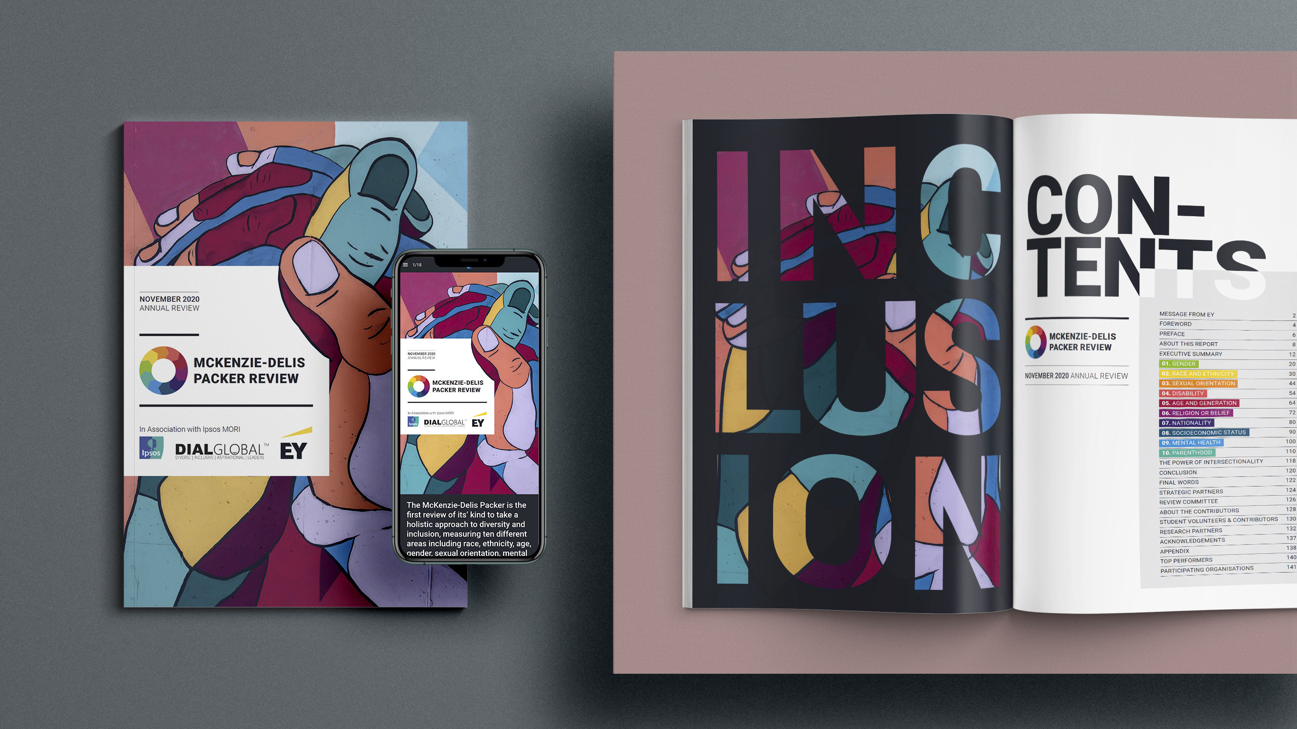
So, we chose street art as the key theme of the report.

Street art provides everyone with a voice and a way to express themselves. It transcends race and status and offers true freedom to be creative. It’s also rebellious and defiant – key characteristics of a true disrupter.

This theme was central to the entire report. You can see it in the graffiti stencil style typography in the quotes. You immediately feel the grungy and protest like connotations. The capitalisation forces decision-makers to sit up and take notice.

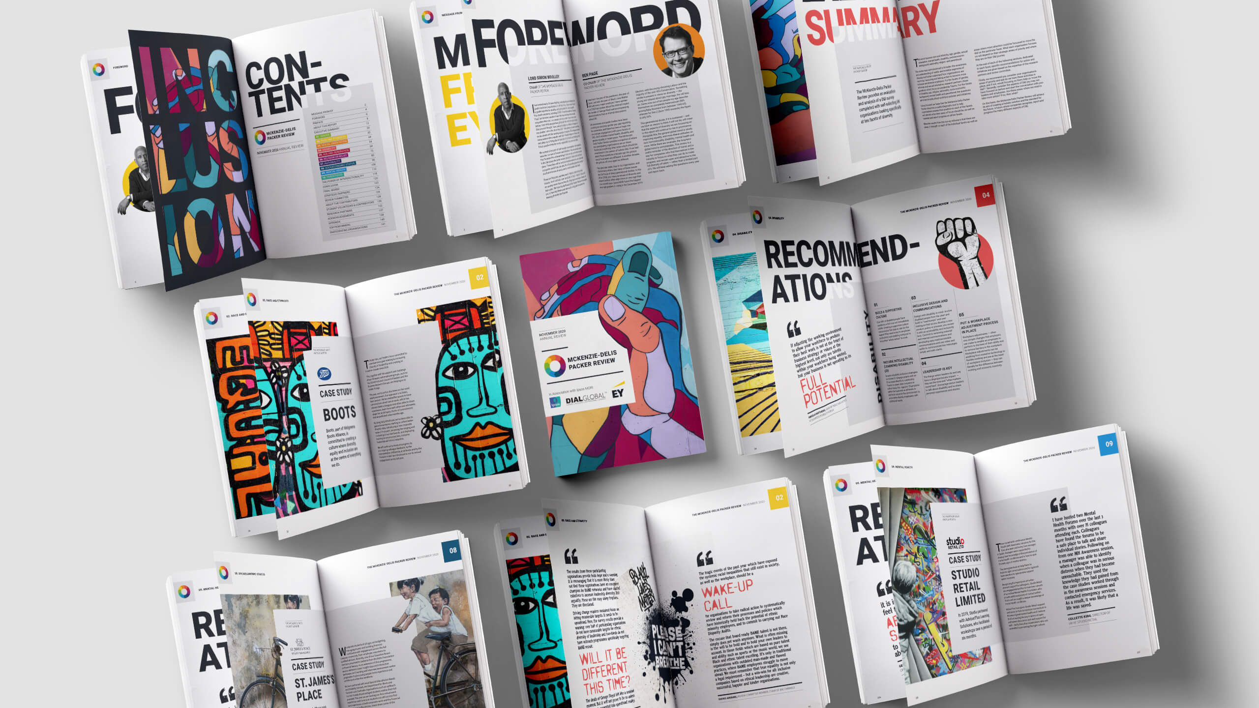
The choice of imagery too is so important to this central theme. Bright, bold images against backdrops of bricks and mortar add to the feeling of challenging accepted norms. Of pushing for change.

However, being a report, there’s a tightrope to traverse. A balance to strike. As a team, we felt it important to mix this rebellious feel with the corporate elements a reader expects to see. So, the text itself is clean, aligned and easily readable. This is a serious issue that needs to be communicated clearly to the readers, and we feel these elements keep the document grounded.

Infographics say a 1,000 words

Another area in which we’ve been creative is in the raw data’s visualisation.

In an information-heavy document such as this review, how this data is communicated plays an important part in how it’s received. To make these statistics visually pleasing, we utilised informative graphics, placed alongside traditional charts and graphs.

Read more: Infographics in the age of the infovore [Updated for 2020]

These infographics quickly communicate their information in a way which is fun and easy to digest. This juxtaposition with longer pieces of text varies the document, keeping it interesting for the audience.

Forward-thinking, these graphics are also easy to repurpose, share on social media or display in presentation slide decks, should a future need arise.

Making it interactive

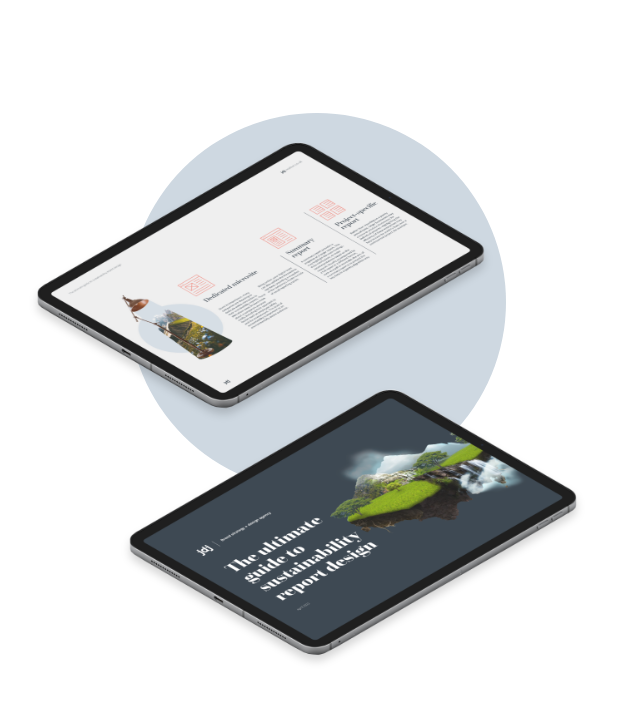
Given the ease of distribution, the key findings of the report lend themselves to digital circulation channels. To make this digital offering interactive, we converted the original report to a web publishing tool called Foleon. Media-rich, we designed this digital publication to encourage interaction, with the magazine-style, linear format guiding the user from page to page.

Similarly to the design of the main report, the Foleon has the same central themes of protest and change. We’ve replicated the street art elements in both media, transporting the assets from the report to the screen. Importantly for the authors, the Foleon offers a snapshot of what is available in the main report, encouraging downloads of the full version.

Street art provides everyone with a voice and a way to express themselves.

Working with multiple stakeholders

Unlike some projects we’ve worked on, once the initial concepts had been agreed, the key stakeholders had a clear vision of how they wanted the report to look from an early stage. This meant our challenge was to guide them throughout the process, help with the conversion to digital and inspire them in their search for wonder.

This was a genuine team effort, with the design collaborating to create different visual elements of the review and Foleon.

Our copywriters also helped ensure the accuracy of the report, proofreading and consistency checking the document several times. It’s fair to say the time we’ve spent working with the report means we’re all well versed in the current diversity & inclusion landscape!

But it has all been worth it to create a document we’re all exceptionally proud of, and one we hope will help inspire others to take action to make UK workplaces ever more inclusive spaces.


JDJ – The annual report design specialists

This document is one of the many designs we have created for businesses in the financial and professional services sectors. If you like what we’ve done with the McKenzie-Delis Packer Review and would like us to help with your annual or sustainability report design, please get in touch with our team on 01223 750234 or email hello@jdjcreative.co.uk

Related Posts

Design

JDJ Creative:
2023 review

Read article

Design

How to make
a sustainability
report XBRL-
compliant

Read article

Data

The Impact
of Visual
Storytelling in
Financial
Marketing

Read article

Design

The Role of
design in
investor
presentations
and pitch
decks

Read article

Design

Why choose
JDJ Creative to
design your
Sustainability
Report?

Read article

Design

What are
brand
guidelines?

Read article

Design

On the rise of
Sustainability
Reporting

Read article

Design

A quick guide
to Exhibition
Stands

Read article

Company News

Reflecting on
a wonderful
relationship

Read article

Design

How to choose
the right
annual report
design agency

Read article

Design

A guide to:
annual report
design

Read article

Design

Will AI replace
graphic
designers?

Read article

Company News

2022:
A Roundup

Read article

Design

Report design
for the future

Read article

Data

Using design
to better
understand data

Read article

Design

How to design
a sustainability
report

Read article

Design

How to present
a sustainability
report

Read article

Design

Five key steps
to sustainability
reporting

Read article

Design

What makes up
a sustainability
report?

Read article

Design

How to measure
sustainability

Read article

Design

Is print
still
relevant?

Read article

Design

Are brochures
still effective?

Read article

Design

What is
sustainability
reporting and
why is it
important?

Read article

Design

What to look for
when proofreading
an annual report
(or other business
document)

Read article

Company News

2021: A year
in design

Read article

Design

How to measure
the impact of
thought
leadership

Read article

Company News

Brands we’ve
worked with who
are changing
the world

Read article

Design

The psychology
of colour in
branding

Read article

Design

Can graphic
designers
do web design?

Read article

Design

Why are brands
going retro with
their logos?

Read article

Design

How to
choose a
brand typeface

Read article

Design

Women in
art &
design

Read article

Design

Promoting
your annual
report for
maximum
engagement

Read article

Design

Annual report
design tips

Read article

Design

The JDJ Creative
annual report
design process

Read article

Design

Should you
publish a digital
or printed
annual report?

Read article

Design

Planning your
annual report

Read article

Design

The ultimate
guide to annual
report design

Read article

Design

Creativity Vs
Automation

Read article

Design

Corporate review
design: Reimagined

Read article

Company News

Radiance
colour book

Read article

Design

Pollen: Preparation,
Collaboration,
Execution

Read article

Digital

The rise and
rise of video
[Updated for
2021]

Read article

Design

Making sense:
Touch

Read article

Get in touch

We’re always keen to hear from like-minded people with passion and purpose,
so let’s see if together we can bring your vision to life.