The brief
Tipico has been reporting annually on its environmental, social, and governance issues since 2018. For their 2022 report, they wanted to take a different creative approach.
It was Tipico’s strong desire that the report represent the company’s diverse workforce and target audience. It was also important to highlight their mission to electrify the sports betting experience for every customer – to ‘Maximise Spannung’.
In addition, proofreading was required to ensure the sense and grammatic accuracy of the English translation of the report.
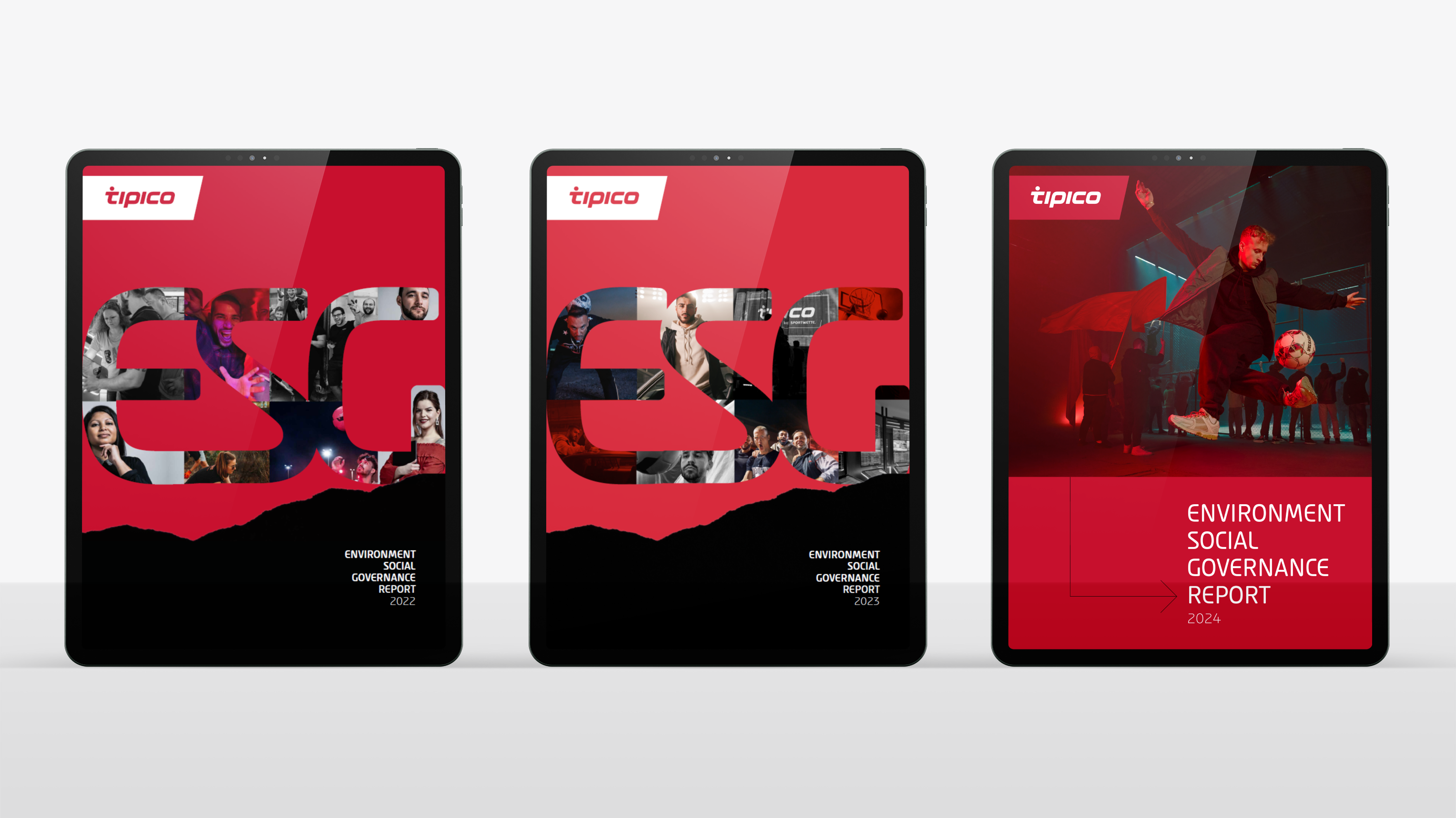
Following the success of the initial report, JDJ was tasked to further evolve the layout for the 2023 and 2024 reports.
Tipico has been reporting annually on its environmental, social, and governance issues since 2018. For their 2022 report, they wanted to take a different creative approach.
It was Tipico’s strong desire that the report represent the company’s diverse workforce and target audience. It was also important to highlight their mission to electrify the sports betting experience for every customer – to ‘Maximise Spannung’.
In addition, proofreading was required to ensure the sense and grammatic accuracy of the English translation of the report.
Following the success of the initial report, JDJ was tasked to further evolve the layout for the 2023 and 2024 reports.
The solution
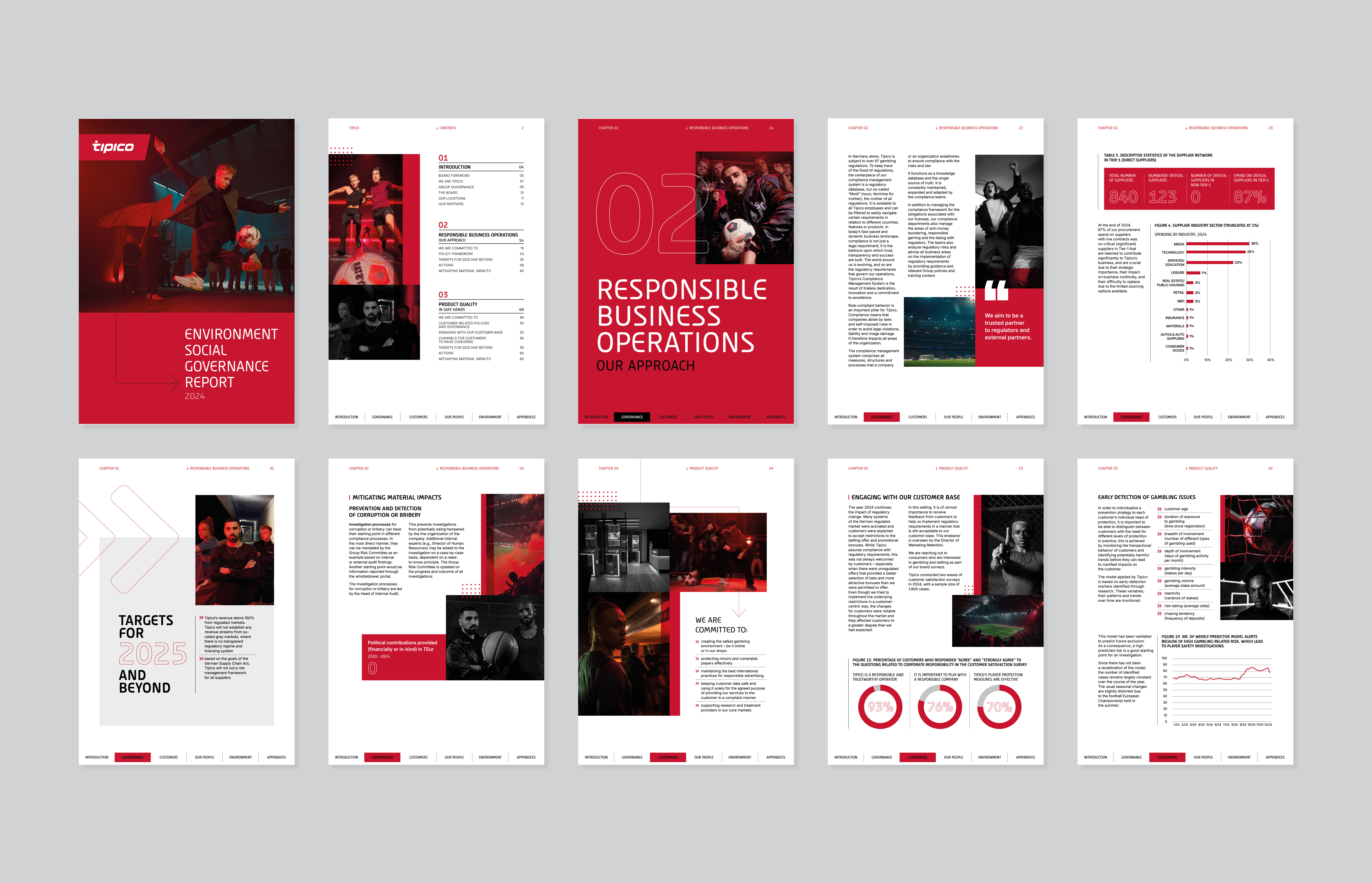
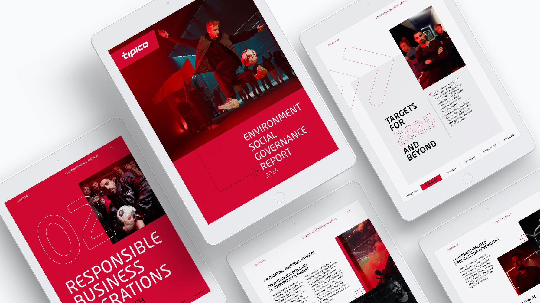
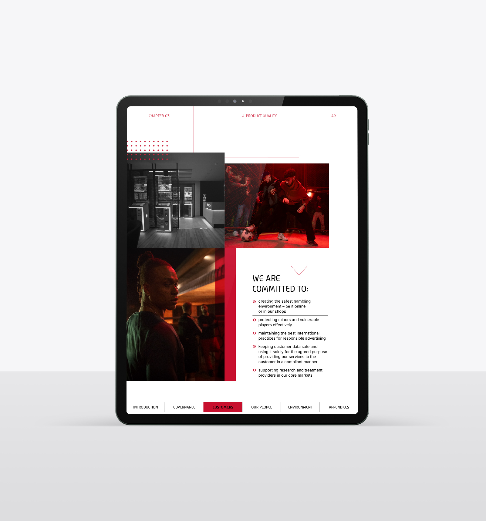
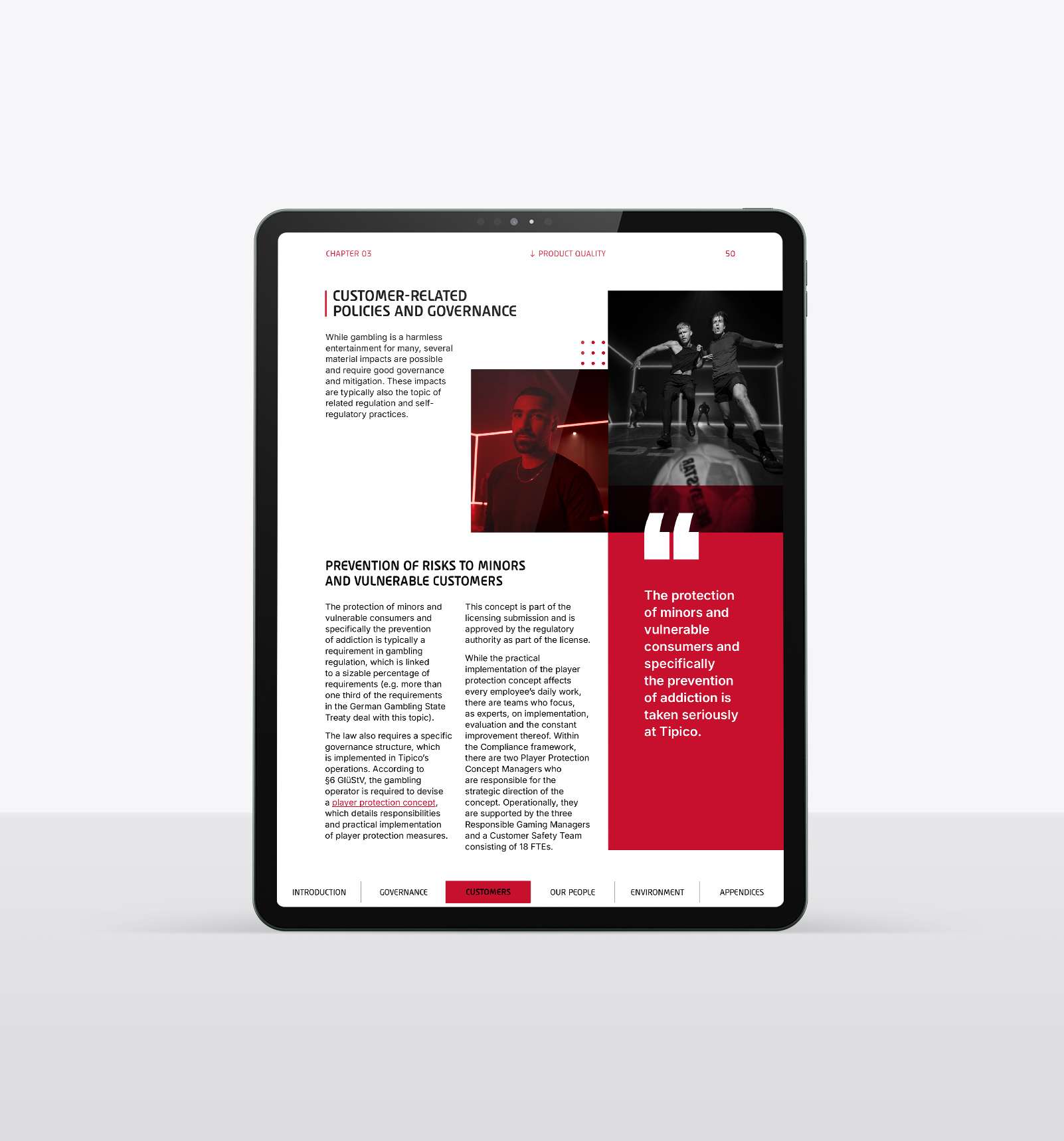
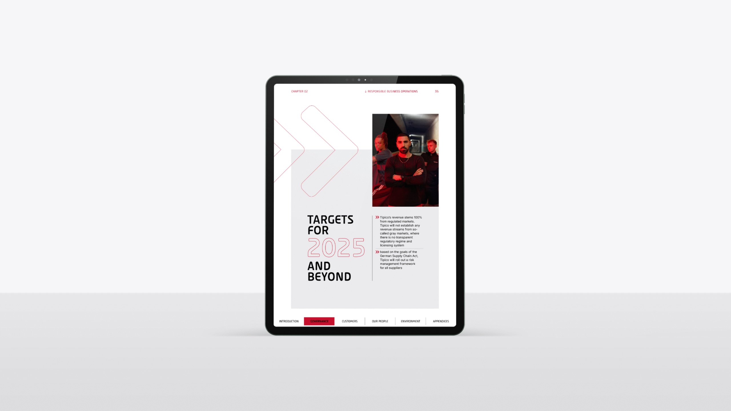
To meet reporting requirements, the document is content-heavy. We made it accessible by separating different sections with distinct visual elements. Case studies and performance indicators break up the content, with Tipico’s signature colours of red, black, and grey adding to the design.
To represent the feeling of ‘Spannung’, we chose dynamic images, with elements overlaid to create visual interest. Despite the large amounts of text, this remains vibrant through the use of graphs, clearly defined sections, and engaging layouts.