Report design + content agency
  • Home
  • About
  • Services
  • Projects
  • Insights
  • Contact
using-design-to-understand-data
29 September 2022

Using design
to better
understand data

Introduction to data visualisation…

Ever since early man painted the walls of their caves, design has been instrumental to how we present data. Since then, pioneers such as William Playfair, Francis Galton and Florence Nightingale have pushed the boundaries of data visualisation with their maps, grids and graphs.


Nowadays turning data into graphics can be done in just a couple of clicks. But how does graphic design make data more accessible? What are the best ways to visualise your data graphically? And how can you use your charts and infographics in other media?

Why is design important in data?

Have you ever tried to extract data from column upon column of populated rows in a spreadsheet? It’s easy to become overwhelmed, drowning in a sea of text, numbers and calculations. How much simpler is it to view the same data in the form of a bar or bubble chart?

Likewise, a long block of text can be confusing and time-consuming to read. Often, the same information can be neatly summed up in a handy graphic or graph.

In both cases, great graphic design can make your data easier to understand. Graphs can make it easy to spot trends or highlight anomalies; comparing figures can be done in seconds; opportunities efficiently presented to time-conscious directors.

When used in reports, white papers and thought leadership, data visualisations can break up the text, highlighting key data to skim readers, and making the reading experience better for everyone.

Finally, there’s social media. Good data visualisation or infographics can attract attention and deliver their message in seconds when character counts are limited.

JDJ Logo in circle

“

Great graphic design can make your data easier to understand
Examples of data in graphic design

How do you visually represent data?

Interactive data visualisation

There are many ways to represent data visually. Once confined to static imagery, nowadays the information can be interactive and updated in real-time, allowing the user to delve deep into the data and make decisions based on current information.

This information can be presented on any digital device, including computers, tablets and large interactive walls. With touchscreen technology, this information really is at your fingertips.

Charts and graphs

Charts can be used for a number of reasons. For example, a bar chart, a box and whisker plot or a pyramid chart make it easy to compare different values. A line graph or a scatter plot meanwhile show patterns in the data, such as sales over time, or the relative performance of a team based on two variables. Other well-known charts include bubble and pie charts, which use size to represent volumes in proportion to other values.

Infographics

Infographics are arguably the most creative of all data visualisations, as they take different charts and pictograms and turn them into stories, designed to influence the reader.

They’re also effective, with research by Kissmetrics stating: High-quality infographics are 30x more likely to be read than plain text.

Other day-to-day data visualisations

We use data every day without even realising it. For instance, a scheduling tool can assign different colours to work tasks, while a calendar sorts data by date and time. Likewise, flow charts show the steps involved in a certain task, while a sales funnel can show where prospects are in their buyer journey.


How to choose which data visualisation to use?

Before choosing how you want to display your data, it’s important to consider what you want to achieve with the data, how big the data set is and where you will be distributing it.

As with all things in design, the most important factor is your audience. Think about the technology they will be using, where they will be viewing the data, and their knowledge level on your subject. And then create a visualisation which will convey your information in the most simple way. 


How to repurpose data visualisations

Whether originally designed as a supporting image for a blog post or an infographic in an annual report, data visualisations lend themselves to lots of different mediums. And because they take time to research, design and produce, good data visualisation should be shared far and wide! Not only does this mean you get the best bang for your buck from each piece of work, but it’s also a cost-effective way of generating new content.

To increase the reach and exposure of your data visualisations, you could try repurposing them in the following ways:

Animations – Because they can quickly transmit a lot of information, these visualisations lend themselves to social media posts. And a great way to attract attention on users’ feeds is through movement. So a GIF that highlights a particular stat, or an animated chart that subtly supports an argument can be a winner on digital mediums.

Explainer videos – Video is still one of the most used marketing mediums of the moment. Research shows that 86% of businesses use video as a marketing tool, with 94% of people having watched an explainer video to learn more about a product or service.

Short, and focused on educating the viewer, explainer videos can all be enhanced by an animated data visualisation which presents data without taking away from the core messaging.

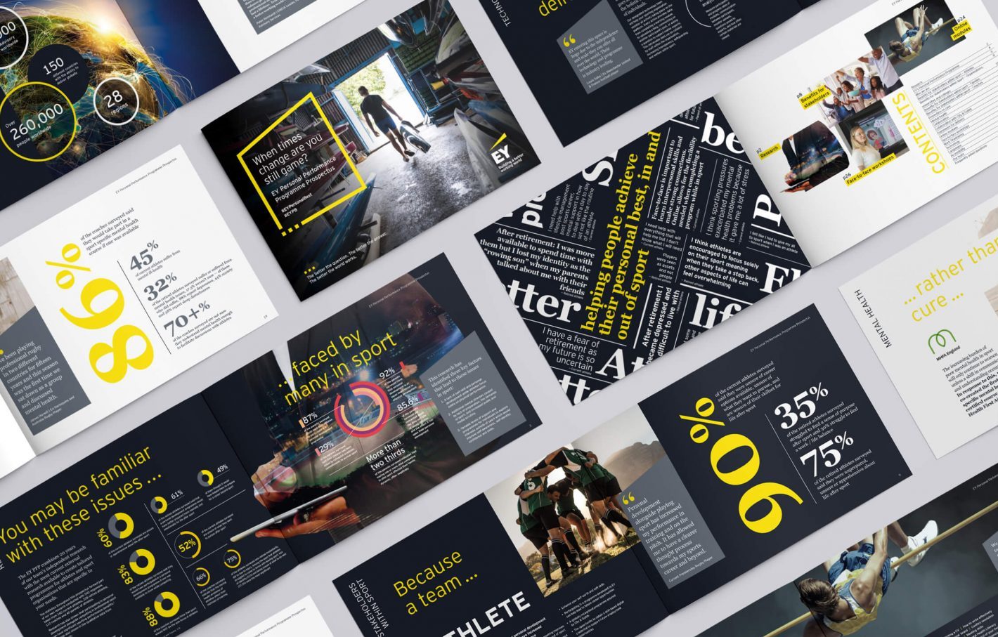
Presentations – While background slides at a presentation should not detract from the speaker, subtle animations can add visual interest, increasing their impact. And presentations don’t have to be confined to the lecture theatre. They can be utilised on big screens at trade shows, as digital learning aids, or in office foyers. Where background noise may be an issue, these visualisations will cut through and effectively present their message, visually.

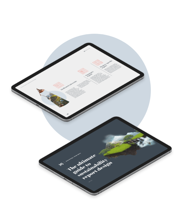
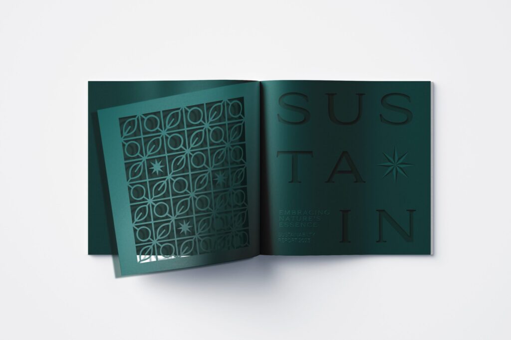
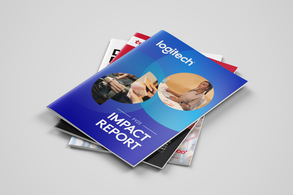
Reports – As we explore in our blog, ‘Choosing the right channel for your annual report’, reporting documents can take many formats. Static visualisations used in printed reports can be animated when displaying on a microsite or interactive pdf. However, it may be harder to convert an animated asset for print, so it’s important to consider your medium before starting the design process.


In summary…

Data visualisations are a great way of portraying complex information in an easy-to-digest and often beautiful format. Once created they can be rolled out far and wide to maximise their reach. Just remember to make them as simple to understand as possible, and you’ll have a visual asset that looks great across platforms and different media.

Share

Related Posts

Discover our blog

Design

JDJ Creative:
2024 review

Discover more

Company News, Design

Celebrating
positive
impact

Discover more

Design

Design for
sustainability-
focused
sub-brands

Discover more
Covers of ESG and Impact Reports designed by JDJ Creative

Design

A guide to annual report cover design

Discover more
In Search of Wonder Lifetime Achievement Award Winner, Prof. Sir Mene Pangalos receiving his award from Jean & Mario Prelorenzo, JDJ Creative

Company News, ISOW

Profile on…
Prof. Mene
Pangalos

Discover more

Design

JDJ Creative:
2023 review

Discover more
Quick Links
  • Blog
  • About
  • Privacy Policy
  • Terms and Conditions
  • Cookie Policy
DESIGN
  • Annual reports
  • ESG + sustainability reports
  • Thought leadership
  • Other reports
STORYTELLING
  • Content creation
IMPACT
  • Exhibitions
  • Presentations
  • Communications planning
SECTORS
  • Corporate & Professional
  • Financial
  • Science & Tech
CONTACT US
  • hello@jdjcreative.co.uk
  • JDJ Creative Ltd.
  • 10 Jesus Lane
  • Cambridge CB5 8BA

Subscribe

Sign up to our monthly newsletter to receive your guide to thought leadership design.

Cover of the eBook: 'A guide to thought leadership design'

Subscribe

Sign up to our monthly newsletter to receive your guide to annual report design.

Subscribe

Sign up to our monthly newsletter to receive your guide to sustainability report design.

JDJ Creative 'How to design a sustainability report' guide digital mockup on ipad devices