Everything you need to know about infographics in the age of the infovore
People are information hungry and time-poor. The desire to keep on top of trends, news, knowledge, facts and figures is prevalent. But sometimes making time to seek out and read entire articles can prove difficult if not impossible.
An infovore — a person who indulges in information gathering — has countless ways to indulge: we consume hundreds of original pieces of content every day from social media, printed media, TV and other devices. Designers, therefore, are constantly looking for ways to deliver complex information in a simple, engaging and easy-to-understand way.
That’s where Infographics are ideal.

So, what is an infographic?
According to the Cambridge English Dictionary, the official definition of an infographic is:
‘A picture or diagram or a group of pictures or diagrams showing or explaining information’.
In short, an infographic is a blend of information and graphic.
An infographic tells a story by using a visually pleasing combination of graphics, data, thoughtful typography and colour. Many formats exist and unique infographic styles can work within any brand.
When did infographics start?
Originally seen as cave paintings, Infographics have existed in one form or another for over 30,000 years. It is unsurprising then that infographics in their current form are still as popular as ever.
Since these earliest examples, the infographic has evolved. A map scratched onto a clay tablet has been traced to the ancient city of Babylon from sometime around 600 B.C. Likewise, there are examples of maps charting the solar system from the 11th Century.

Alongside William Playfair’s invention of line, bar and pie charts, more examples of early infographics include the English chemist, Joseph Priestley’s timeline charts – Chart of Biography (1765) and New Chart of History (1769). More and more examples of infographics would soon join these visual study aids, as the 19th century brought with it a boom in data visualisation.
Infographics in the 19th century
As data-based social science became accepted, displaying data in a visual form became more popular. Famous examples include Florence Nightingale’s coxcomb chart, which highlighted the high number of preventable deaths in the Crimean war; and John Snow’s cholera map which highlighted cases around a single water pump.

Then, in the early 20th Century, the designer Alfred Leete created a poster for the London Underground using the portrait format and many of the elements seen in modern day infographics. Later still, the German Otl Aicher created the first ever pictograms for the 1972 summer Olympic Games in Munich. By the 1970s, Peter Sullivan was regularly using information graphics in the Sunday Times – graphics that would accompany stories throughout the 80s and 90s.
When did infographics become popular?
In the internet age, infographics went from strength to strength, peaking in popularity around 2013. Many companies began churning out infographics of varying quality. Nowadays, our understanding of what makes an infographic effective has increased, as has our understanding of the importance of good design in creating these graphics.
Today infographics are effective tools to convey information on social media channels, in annual reports and on pages across the internet.
Are infographics still relevant in 2021?
Given that web searches for infographics peaked in 2013, it’s understandable that today people are asking ‘are infographics dead?’.
The evidence suggests not.
Research by the Content Marketing Institute shows that 65% of B2B marketers used in Infographics/Charts/Photos in 2020.
Anecdotal evidence adds further weight to this theory.
In a year unlike any other, officials used infographics throughout 2020 to convey information about the COVID-19 pandemic in an easy to digest format. Both global governments and the World Health Organisation (WHO) utilised handy infographics to show statistics surrounding the virus and various measures to combat it.
The information they have presented us through data visualisations during the pandemic highlights why infographics are important in raising awareness, in this case of infection rates and the importance of practicing good hygiene.

Why are infographics effective? – the benefits of infographics
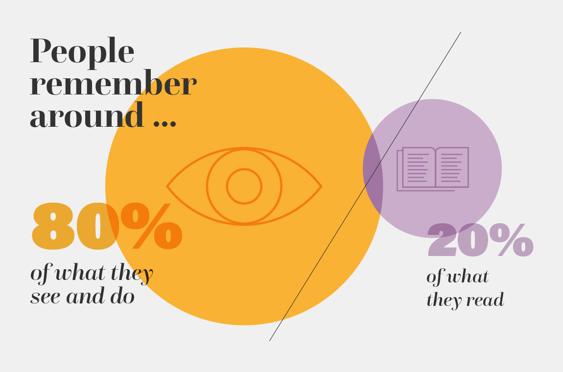
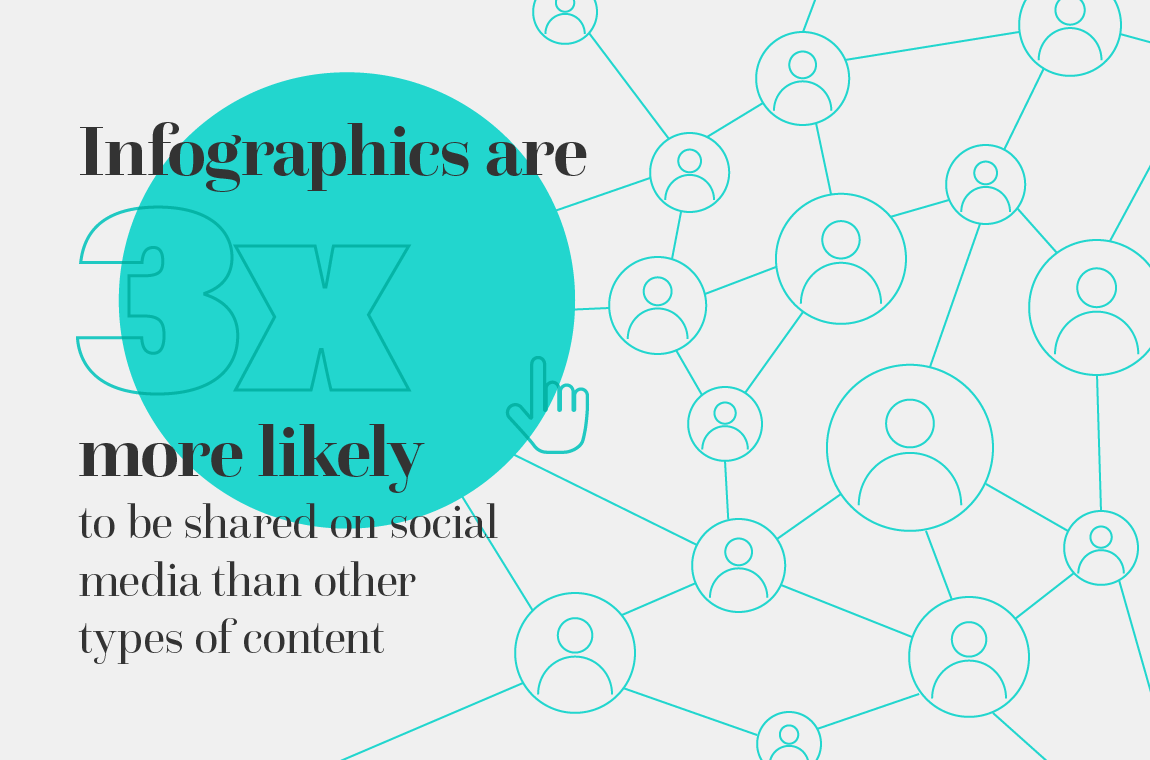
What makes infographics effective? Well, infographics are an invaluable way to deliver complex information, quickly. It’s proven that visual information is more memorable than the written word: people remember around 80% of what they see and what they do, compared with just 20% of what they read. Infographics can play a key role in brand strategy, weaving brand awareness and messaging into targeted social campaigns. Indeed, an infographic is three times more likely to be shared on social media than any other type of content.
At its best, an infographic can be a beautiful, engaging piece of artwork, bolstering or even elevating a brand’s position while simultaneously creating a social media stir.
Unlike those seen about 10 years ago, which were often long, today’s infographics are shorter and frequently split up to fit well on social media platforms, such as Twitter and LinkedIn. They’re increasingly interactive, even taking the form of video.
Because of their effectiveness and flexibility, it’s inevitable that they’ll continue to be popular in 2021 and for years to come.

Infographics and data visualisation
In today’s world of big data, how businesses choose to display their figures can affect how quickly readers can interpret the information and what conclusions they can draw from it. While on the surface, the terms data visualisation and infographics may appear to be the same, there are in fact some subtle differences between the two.
We look at this in more detail in our blog – The differences between infographics and data visualisation – but the key points are these:
- Infographics simplify data subjectively, guiding readers to a predetermined conclusion
- Data visualisations represent data objectively in real-time, presenting just the raw data to allow users to determine their own conclusions
How infographics are made
While it may look simple, an infographic can be hard to get right. To improve the effectiveness of your infographics, follow these four steps:
- Plan – what is the subject for your infographic? What is its goal (to inform, educate, sell, etc.)? What format will it take? Where will the information come from? Once you have this information, you’ll be able to target the copy, stats and design to achieve your goals.
- Research and collect the data – whether original research or facts from other sources, the statistics they contain are the key to a successful infographic. They need to be both interesting and relevant, but also 100% accurate. Nothing will discredit your message more than false claims. Ensure you can back up your statements using reputable sources, such as industry reports, respected organisations or published books.
- Create the graphic – Having collated your data, it’s time to present it in your chosen layout. Good copy consisting of short, bite-sized sentences can influence the narrative, helping the document to flow. Your designer can then present this data in the best way possible using our design pointers below. If creating your own infographic, pay specific attention to colour schemes, fonts, white space and chart types, all of which can make your infographic stand out.
- Promote your infographic – whether sharing directly to social media or adding to a blog post or white paper, make sure your audience knows about your content. Adding a link to email marketing campaigns, breaking up the content to create social panels and sharing to platforms such as Pinterest are all effective ways of marketing your design. Don’t forget to add alt text if sharing on a website, to ensure Google understands what it’s about and can index it correctly.
Where to create infographics for free
Following hot on the heels of the increase in popularity of infographics came the rise of free infographic maker tools. These tools made it easier for non-designers to create great looking infographics and data visualisations.
But, they have their limitations.
Being template-based, they can be inflexible when looking to brand their look and feel. There’s also always the chance that your reader has seen the same template before, which can look unprofessional on your part.
Having said that, by following our design pointers below, these tools provide the opportunity for anyone to create a professional-looking infographic.
Examples of free infographic maker tools include:
Of course, for the best-looking infographics, you’ll need a professional design agency, such as JDJ Creative. We create infographics for annual reports, thought leadership materials, social media or as standalone items. The best bit is, we never use templates, so you can be sure your infographic will be unique.

