Infographics in annual report design and thought leadership
Annual reports can read as monotonous banks of text and numerals, interesting only to financial experts. For a report to be accessible to the widest spectrum it requires more accessible information. Bite-size graphics, interactive charts and infographics can be consumed quickly but convey information that lasts longer than text alone. Using brand and creativity, these data visualisation techniques can transform a boring financial or sustainability report into an invaluable document.
Thought leadership materials, insights and papers are by their nature composed of analysis and statistical data. In their rawest form, these numbers and responses can be uninspiring, but in a graphical format, they can be beautiful. Infographics possess the ability to communicate complex information in a simple and visually pleasing way. Charts and graphs meanwhile, can be represented in increasingly innovative forms, creating elegant designs which are both on-brand and inspiring.
Our guides have been written to help busy marketers, C-suite executives and business owners to understand the essentials of the important documents that make a brand successful. We talk you through the entire design process from planning to production.
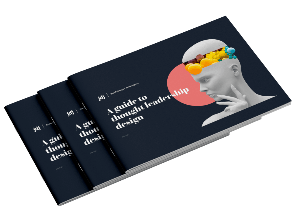
Sign up to our monthly newsletter to receive your guide to thought leadership design.
Sign up to our monthly newsletter to receive your guide to annual report design.
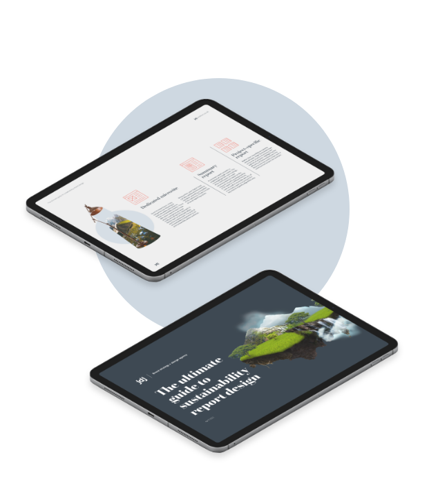
Sign up to our monthly newsletter to receive your guide to sustainability report design.