The brief
Founded in response to the failure of current drug development methods, which often overlook the important role of drug-microbiome interactions in individual health outcomes, BioCorteX is currently developing its key product, CarbonMirror™.
Having achieved seed funding, BioCorteX required support in defining its market positioning and messaging alongside updated visual brand elements to sustain its current growth.
Utilising these updated brand assets, BioCorteX also desired a new website to act as an information hub for new investors and external stakeholders.
The solution
BioCorteX has a unique offering. But it was a message which needed refining. Together with the founders and key stakeholders, we uncovered BioCorteX’s ‘why’, ‘what’ and ‘how’ and developed their key marketplace differentials.
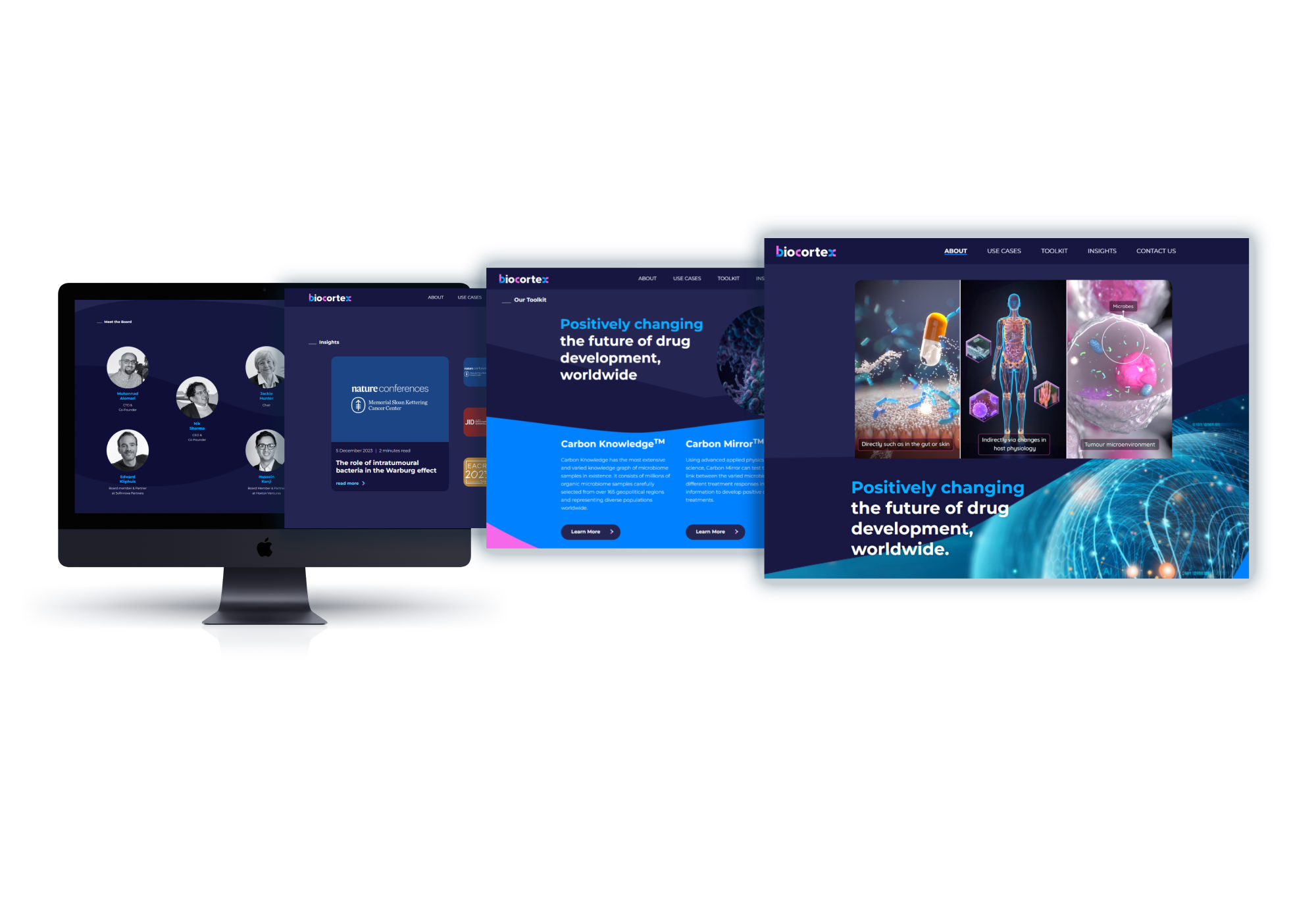
Through our bespoke messaging framework, we evolved the BioCorteX story; utilising these findings to create a new set of brand assets, including a distinctive wordmark logo.
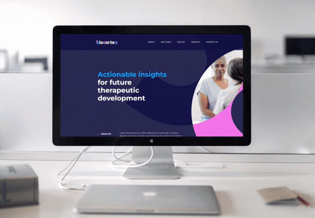
These elements then formed the basis of the brand’s new website, an important resource targeting future investors and end-users in the techbio space.
BioCorteX has a unique offering. But it was a message which needed refining. Together with the founders and key stakeholders, we uncovered BioCorteX’s ‘why’, ‘what’ and ‘how’ and developed their key marketplace differentials.
Through our bespoke messaging framework, we evolved the BioCorteX story; utilising these findings to create a new set of brand assets, including a distinctive wordmark logo.
These elements then formed the basis of the brand’s new website, an important resource targeting future investors and end-users in the techbio space.