With a diverse and growing portfolio of anaerobic digestion plants, Biocapital has become the largest biogas producer in the UK by MWh.
By investing in operational and greenfield assets, Bio Capital is proud to be making a significant contribution to the green economy, reducing emissions and protecting our environment.
The brief
As part of its ambition to become the number one renewable energy investment company in the UK, Bio Capital initially approached JDJ to refresh its brand logo.
Their existing logo was not practical, with its six overlapping constituent colours not working well in print or embroidery forms. Alongside a primary company logo, they required a uniform style for sub-brands under the Bio Capital Group.
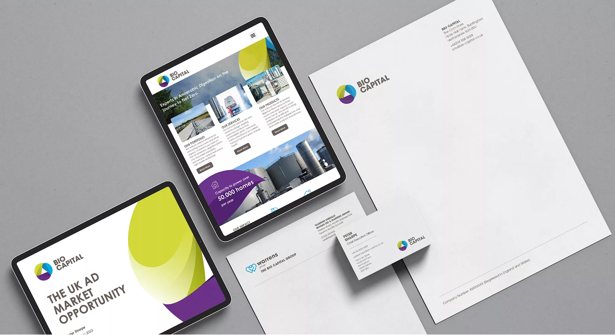
In addition to creating a logo and rolling it out across all marketing assets, we were tasked with designing a new look website for the brand to capture enquiries and enhance their future growth plans.
The solution
Beginning with a brand exploration we presented several different potential logo styles, exploring styles, colours and fonts. From these initial ideas, we embarked on a process of iteration to result in the final choice.
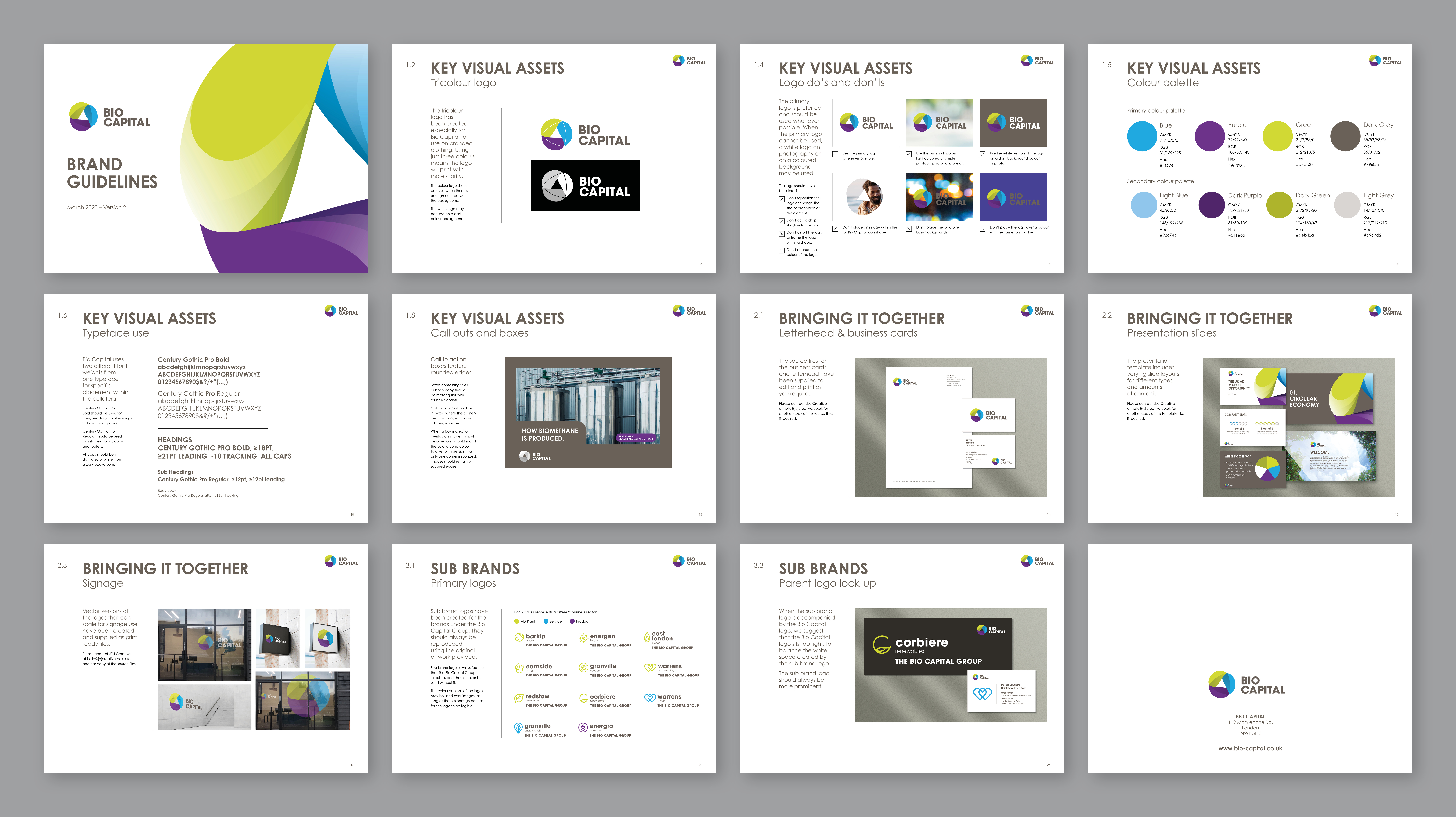
Using three core colours to represent the combination of Bio Capital’s key brand ideals - social (blue), leadership (green) and the environment (purple) - the new logo represents an evolution from their previous symbol. Not only does this logo work at small scales for digital mediums, but a tricolour version was created to be practical for use on branded clothing and printed materials.
Alongside the main logo, a complementary icon style was created that aligns the approachable visual language of the logo with other elements in the brand toolkit.
This colour scheme and typography choice were then expanded to the sub-group logos to maintain brand consistency across all companies within the group.


When creating the new look bio-capital.co.uk, we wanted to create a modern looking site that would act as a lead generation tool for the company. Focussed on businesses, the site needed to instantly explain who Bio Capital are. By splitting their offering into services, products and portfolio, we were able to create an intuitive navigation. Combined with real photography and animated elements, this is a modern-looking site which showcases the brand and its sub-brands effectively.
Visit the website: bio-capital.co.uk