Ooredoo, the Qatar-based telecom company, is one of the largest in the world, operating out of 10 countries across the Middle East, North Africa and Southeast Asia. Listed on the Qatar Stock Exchange and the Abu Dhabi Securities Exchange, the company has a customer base of more than 100 million.
The brief
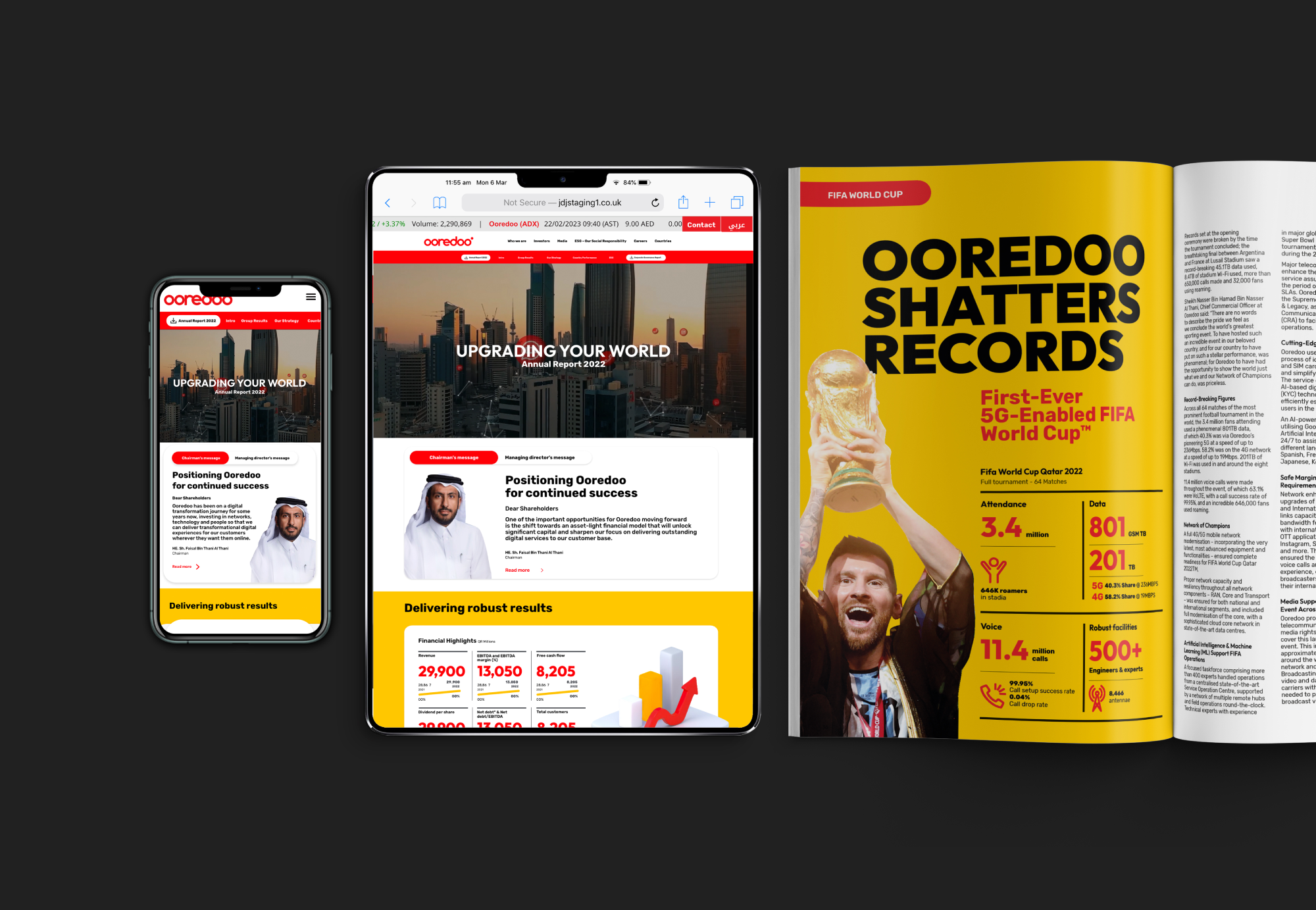
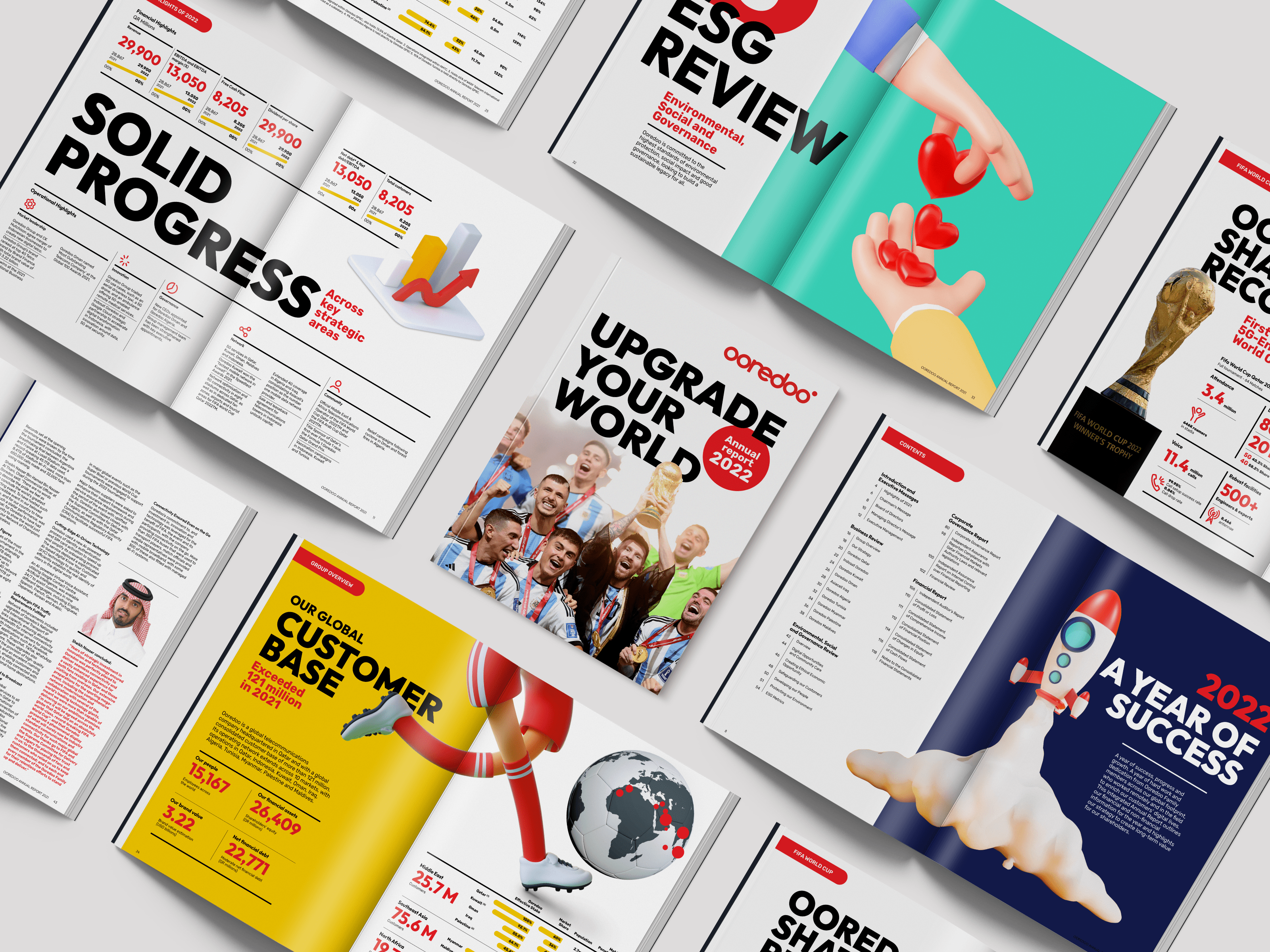
Ooredoo approached us to design the digital and print versions of their 2022 annual report. Having recently refreshed its brand, this report was to be the first to use the new styles, some of which were not fully established. As a digital communications company, a dedicated microsite was also required to showcase the key report findings.
Finally, being based in the Middle East, Arabic versions of the report and microsite were also needed, alongside an English version.
The solution
As the release of the report coincided with the conclusion of the Fifa World Cup, of which Ooredoo was an Official Telecommunications Operator, we selected the theme of soccer to run throughout the document. This is particularly evident in the use of the striking image of Lionel Messi lifting the trophy in a bisht on the front cover.
Using the bold tones from Ooredoo’s brand colour scheme, we were able to create templates which represented the excitement generated from both a record-performing year for the company and a proud one for the country.
Working across timezones, we kept on top of the project through our dedicated account manager, and regular video calls to ensure alignment at every stage.
Having developed the templates, the files were supplied to artworkers native to Qatar to flow in the text, ensuring consistency throughout.


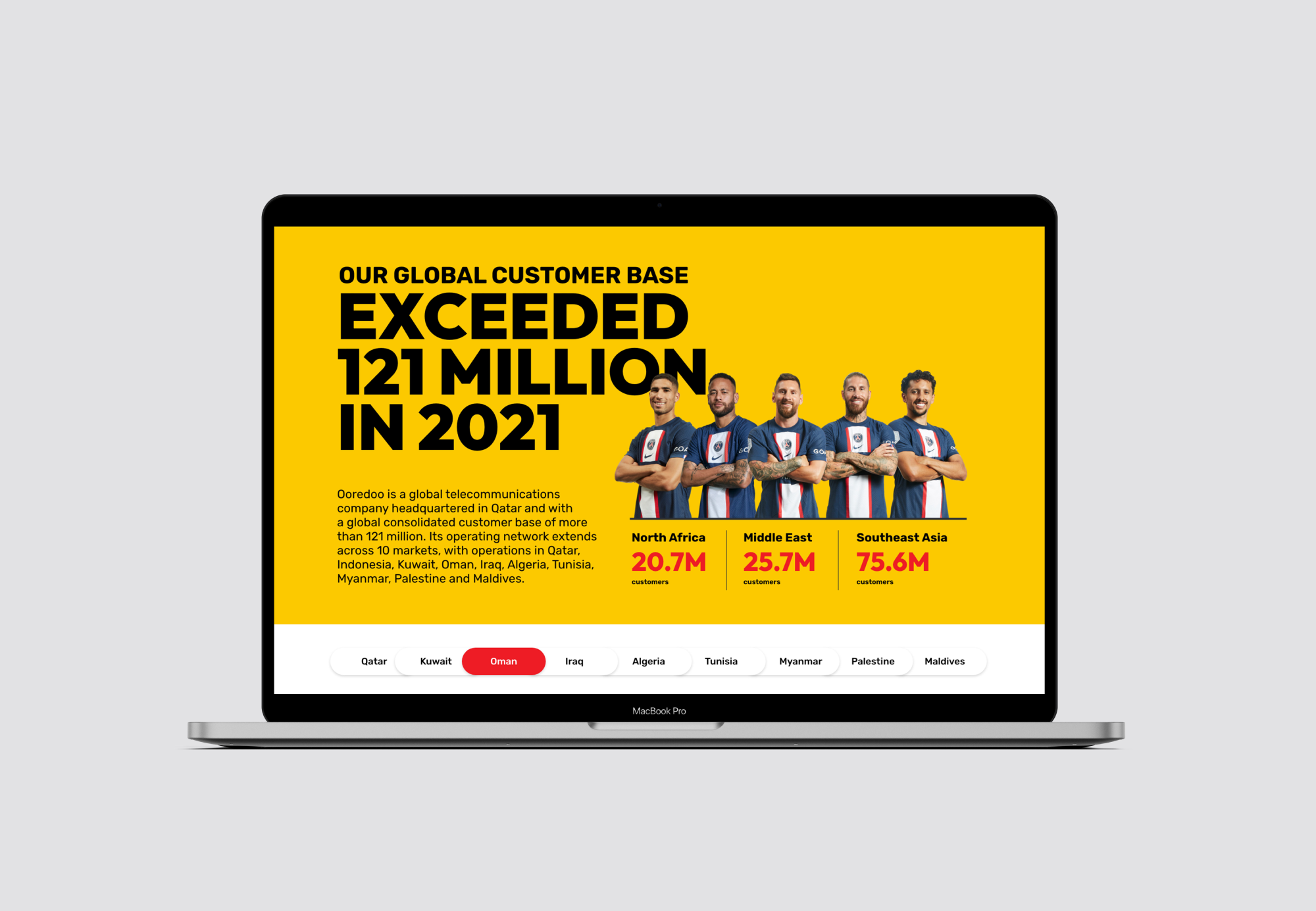
Working alongside Ooredoo’s development team, we created an interactive microsite that fits seamlessly with the organisation’s other web pages. Designed to provide a snapshot of the report’s results, the microsite is a great tool for showing key information in an interactive way.
View the microsite: Report microsite
Read the report: Ooredoo 2022 Annual Report
Awards
Best Annual Report Print Designs by DesignRush.
