The brief
As preferred suppliers to EY, the Principal Sponsors of the Parker Review, we were asked to produce the original report document and subsequent update reports annually for the past eight years. Aimed at the C suite, the document had to be professional while still inspiring them to take action to meet difficult targets.
Following the retirement of Sir John Parker as Chair in March 2022, EY asked us to create a website for the report to showcase its findings and provide a legacy to Sir John.
The solution
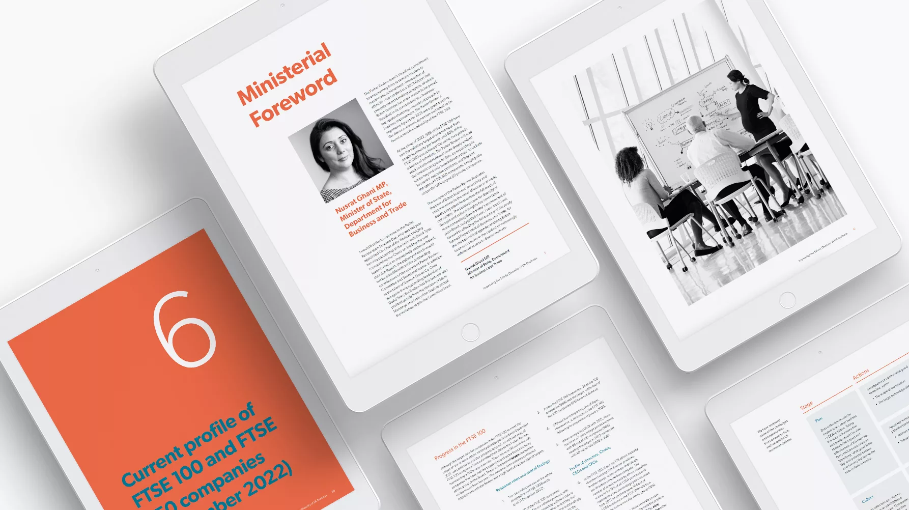
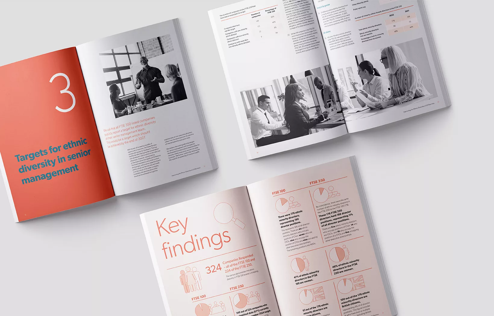
Utilising a basic colour scheme throughout, we were able to bring callouts and key statistics to the fore through the contrast of the ‘burnt sienna’ against a predominantly white background. The use of cyan for headers provided additional contrast, while the use of black and white photography added to the professional look and also backed up the underlying themes of the report by taking colour out of the equation.
Having continued these themes across the subsequent reports, we were able to incorporate them into the new website. A wonderful way to showcase the current findings of the new report, we introduced movement in the form of counters to show the key figures. Built with SEO in mind, each page has been optimised for relevant keywords to achieve page 1 rankings for the chosen search terms.
Read the latest report: Improving the Ethnic Diversity of UK Business
Visit the website: The Parker Review website