The Brief
Nu Quantum approached JDJ to assist them with the creation of their brand identity and outward marketing messages.
The objective was to create an exciting brand that would appeal to potential investors and commercial partners globally, as well as excite and attract top talent in a highly competitive market.
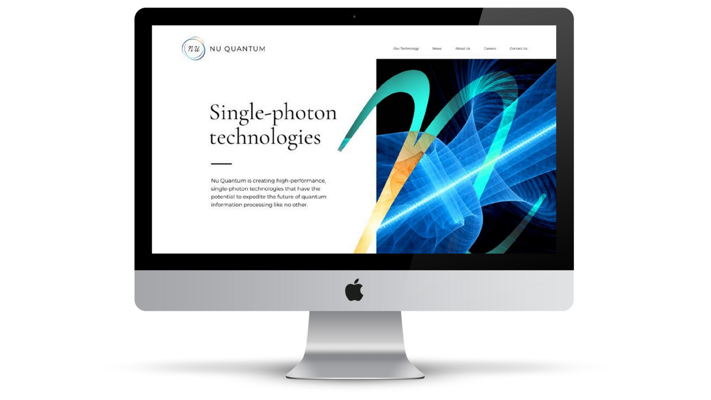
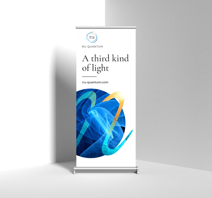
Additionally, further assistance was needed to design and rollout marketing collateral including a redesigned website, office signage, exhibition banners and clothing.
Nu Quantum approached JDJ to assist them with the creation of their brand identity and outward marketing messages.
The objective was to create an exciting brand that would appeal to potential investors and commercial partners globally, as well as excite and attract top talent in a highly competitive market.
Additionally, further assistance was needed to design and rollout marketing collateral including a redesigned website, office signage, exhibition banners and clothing.
The Solution
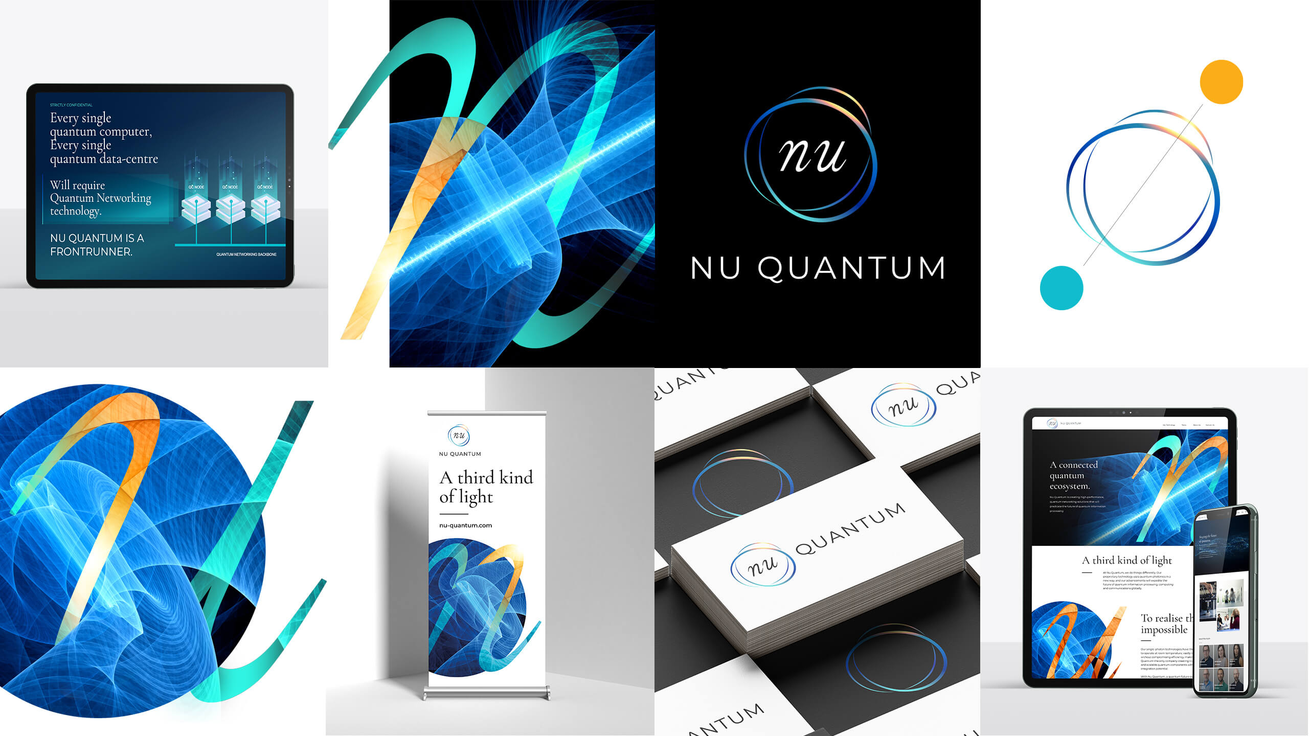
JDJ Creative worked with Nu Quantum to unravel the complexity of their science and identify three core messages to differentiate their brand against competing technologies.
Through stakeholder workshops, competitive analysis and in-depth market analysis, JDJ were able to assist Nu Quantum to build a brand that not only aligned with all their strategic priorities but was easy to understand and accessible to all stakeholders.
We produced a visual identity that represented the business’ key differentiators and highlighted three core marketing messages. Implementing a triad design into their logo, we deliberately played on colour temperature as a market differentiator, temperature being a key component of their value proposition.