The brief
For their 2023 report, Logitech wanted an impactful design that succinctly demonstrated their sustainability achievements, as part of their journey towards being carbon-positive by 2030.
An important document for investors, the Impact report had to be sophisticated and professional, with products at the forefront. With visual engagement a key consideration, it was vital that the report had a joined-up feel that was consistent throughout.
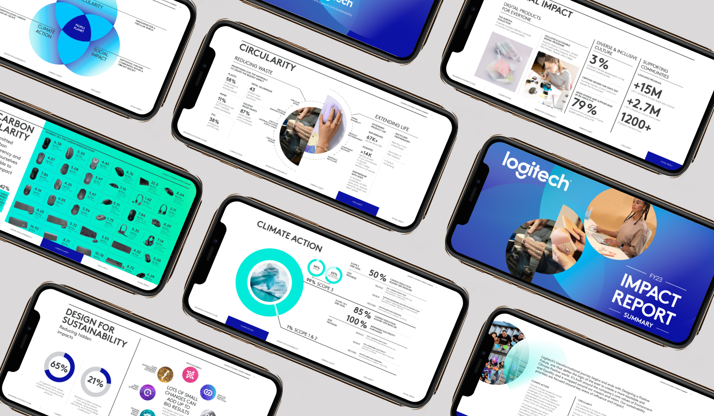
Alongside the main report, a separate executive summary was required, with many of the graphics needing to be adaptable for use on the company website.
The solution
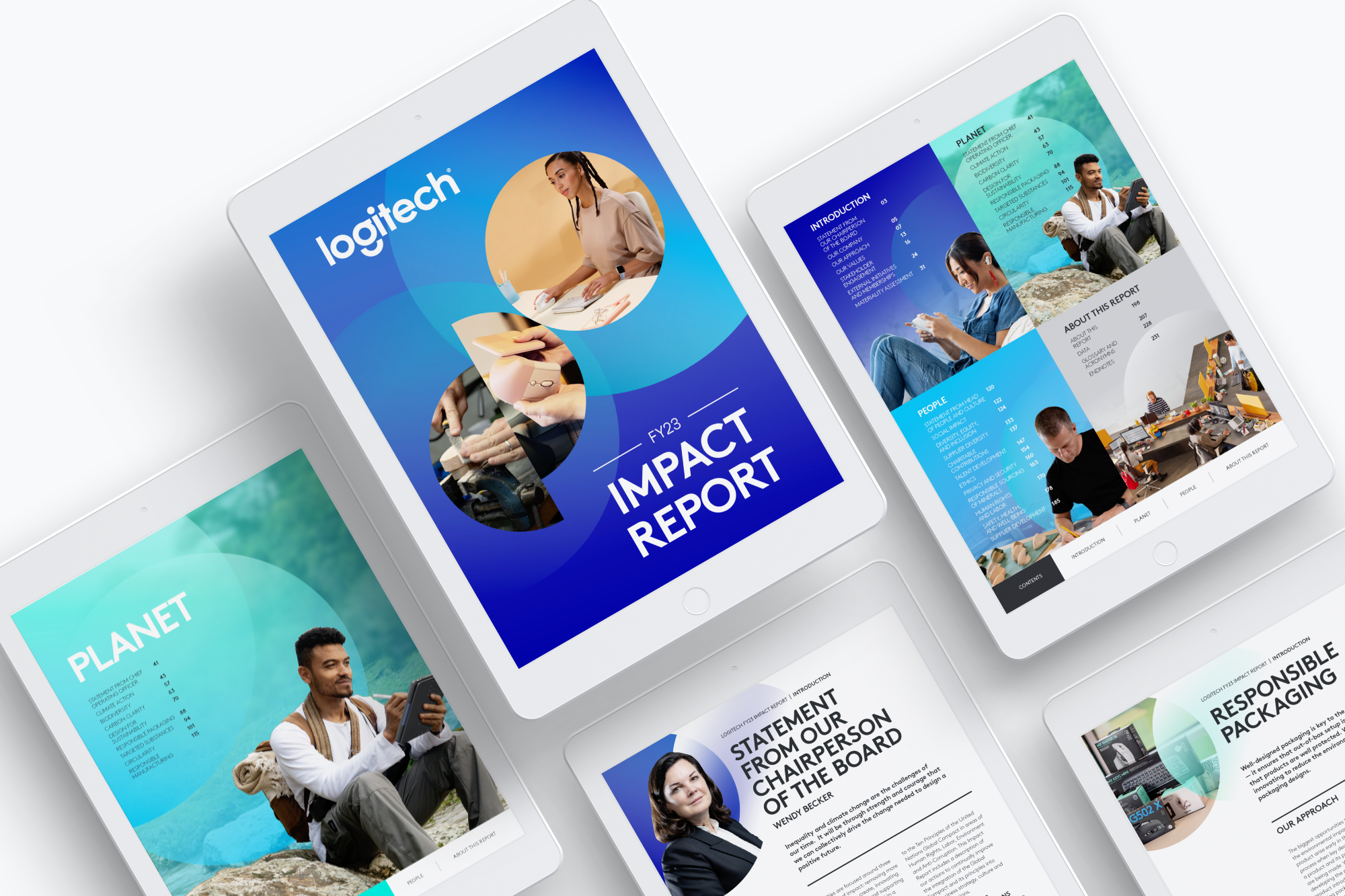
Following the company’s chosen tagline of ‘Designing for sustainability’, the report follows the story of Logitech’s journey of impact. This is reflected in the image choices – where people using Logitech’s products showcase the end result – and through the overlapping circles to represent movement towards a goal.
To create the professional feel desired, we kept the internal pages clean with a white background, with colour blocks highlighting callouts and providing visual interest across the pages. The predominant colours used in the infographics and charts were representative of each section of the report, aiding with the navigation and consistency required throughout.

