As a brand strategy and visual design agency we keep on top of the latest design trends. This allows us to ensure our client's brands are current. One such trend amongst older brands is that of a return to the designs of retro logos from the past...
Why are retro logos coming back?
In graphic design, trends come and go in the blink of an eye. What was cool yesterday is outdated today. But that doesn’t mean that an excellent design is not still an excellent design.
It’s interesting to reflect on a trend that’s been popular in branding for the past few years – that of a return to retro logo designs of the 60s and 70s.
By going back to previous designs, brands can reconnect with previous customers and establish connections with a whole new generation.
In this article, we discuss this trend, why brands are so happy to embrace the past and what it means for the future.
Which brands have a retro logo?
Several instantly recognisable brands have brought back logos from their golden eras over the past few years.
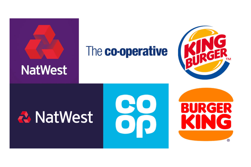
Back in 2016, the Co-op’s banking arm was at a low. It recorded a £1.5 billion black hole in its banking business and its former chair was engulfed in a public scandal. So the whole organisation had a rebrand. The Co-op dropped its corporate wordmark in favour of a modernised version of its cloverleaf logo, originally seen in 1968.
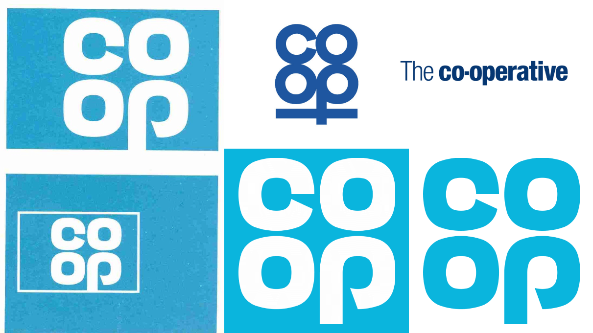
The logo was described by their chairperson, Allan Leighton as signifying “a better way of doing business.” Representing a return to traditional values, it reminded customers of the Co-op’s position as a recognisable, approachable and dynamic brand.
In the same year, another bank, Natwest used original drawings, also from 1968 to influence their new 3D logo.
Then earlier this year, Burger King went back in time to present its new branding. This included an overhaul of its visual identity, encompassing a revamped logo, packaging and uniforms.
Thought we’d make a lil change pic.twitter.com/Tha2HbGMNp
— Burger King (@BurgerKingUK) January 13, 2021
The logo was a big departure from its previous iteration, with the simplified burger design being visually similar to the logo used throughout the 70s to the 90s.
Also this year, Peugeot has introduced a reworking of its 1960s logo, with its iconic lion’s head displayed within a shield – the first time since the 70s they displayed the lion not standing on its hind legs.
Most recently, the American Broadcasting Company has reverted to a flat logo, more similar to its 1962 iteration, removing a 3D sheen and slightly tweaking the font from the previous version.
Why do brands change their logo?
Brands change their logos for several reasons. Sometimes it’s representative of a change in direction – Peugeot is moving from petrol cars to the electric market; other times it’s reinventing themselves, as with the Co-op.
A rival making a change of their own, or just a desire to seem current, and to be constantly evolving in a changing world instigates other changes.
In recent years, brands are changing their logos in order for them to display well across digital mediums such as social media or mobile apps.
Sometimes trends simply change and your current branding becomes outdated.
Whatever the reasons for the change, it’s important not to lose sight of your brand’s purpose and history in order to not alienate your audience.


